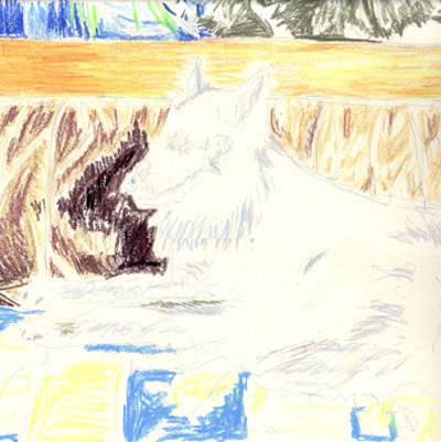
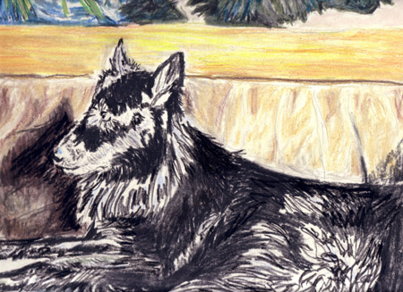
The easiest way to start is with a good reference picture. Although often I work without reference when making a tutorial it should be easier to guide you guys when having a picture to reference back to. This is however, not the best of pictures to work with but still one with different kinds of texture, which is exactly the point and the reason why I chose this particular photograph.
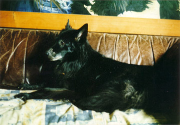
Alright, now that we have a photo for reference, let's begin!
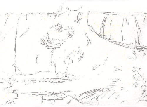
Start by making an outline in graphite or charcoal, whichever you prefer. However, keep in mind that this outline may not be too profound as it shouldn't be too obvious in the final drawing. An excerpt of my line drawing can be seen below.
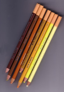
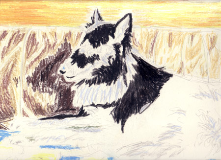
Next, start defining the lighter tones in your drawing. Usually, I start off with soft yellows and browns, with a red underlining. For this drawing I used Van Gogh's soft pastels but I used to get by just as well with Conté Soft Pastels so use whichever you prefer. You can see what I mean in the next picture.
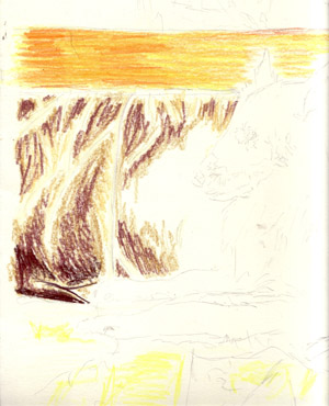
For the piece of wood (yes my dears, that's wood) I used 254 perm.lemon yellow, 284 perm.yellow medium, 227 yellow ochre and 231 gold ochre.
Then I put minor accents on the blanket the dog's sitting on, using 222 naples yellow light and 254 perm.lemon yellow. In also applied the first few shades on the old couch with 222, 227, 343 caput mortuum red and 234 raw sienna.
In this stage of the drawing not much detail is yet needed so it won't take you as much time as later stages. Also, don't worry that your drawing might still look like a piece of nothing, so does mine, as you can tell from the scan.
Next, I'll start applying the basics of the painting above the dog and couch, using various blue and green tones. I decided to start with a 517, or king's blue, which is relatively dark. So be careful and apply lightly. To get to a green accent, I begun with a rather bright green, 618 perm.green light and grey (738 cold grey light) to cover the brighter spots. After this, fetch a dark, more aggressive blue, such as 504 ultramarine to work on the darker parts of the painting, and use 620 olive green for the dark green spots. If you're too insecure to use such dark shades, you can also get by with lighter tones, such as the ones you used before until your drawing has been given a bit more shape, that much is up to you. Since we're working with blues, greens and greys, get down to applying some accents on the dog and his blanket, use soft tones only.
Lastly, I also decided to fill in the shadow of the dog's head onto the couch, use for example Vandyke brown and a darker shade, close to black.
Now, it's time for the real deal! It's time to apply actual shading and definition. Because the background is vaguely defined, I'll get to the dog first, as she is most important in this particular drawing. Pick up the most dreaded pastel of all, black. You can pick whichever black you wish to begin, such as an ivory black, but bear in mind to focus but relax as well. The tricky thing is to avoid making your drawing one big black stain. Focus on the parts that are actually black. And keep in mind not to rest your hand on the paper. If your hand cramps either wind down or take a break. Remember not to touch the pastel, as it will ruin your drawing. If residue continues to bother you, blow lightly. Make strokes in the direction of the dog's fur, and do _not_ scribble in opposite directions. This does _not_ save you time.
On a side note, some of you may have been surprised I use soft pastels pressed into a pencil. Working with chalks and such, it's very hard to define a picture. They may be cheaper but I apply those only for larger areas or big drawings. Since the drawing I'm making is small (let's say about 15inch wide) I mostly use pencil pressed soft pastels. Just so you know.
All right, let's leave the dog for a while and focus on different areas. Let's apply detail from left to right and top to bottom. If you're left-handed, work the other way around. Take whichever deep shade you think is needed to achieve a more detailed look, ranging from dark blue to dark green, to ivory black. I'm not your babysitter. Ha. To accentuate the dark blue on the painting I'm gently working with some shades of blue all the way up to black.
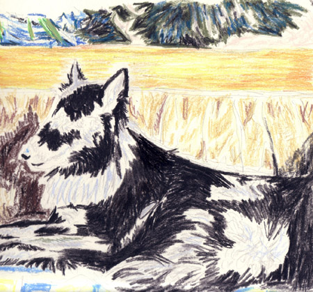
Well now, I've applied a little more detail to the painting and the piece of wood (the painting's frame). I think now it's time to use your stump (tortillon) for the very first time before applying any more detail. Work carefully! Don't use the stump on the dog yet, and once you've blended a little, apply new and more detail to the background.
To make certain colours stick to the paper better, you can apply a pale shade of that colour (or with sanguine or ochre pastel apply a shade of yellow, you can do this instinctively) and you'll notice the pastel will come out brighter than before. Continue to apply soft accents with your stump, be careful there isn't any dark residue left on it, or you'll stain your drawing.
Once you've blended everything, start anew with applying pastel, this time focusing on detail, work carefully, and use your stump to slightly blend when your work gets too rough to your own liking, as all this is up to you.
Now work further on details, also on the dog. Use blue, grey, greens and light browns to highlight the dog's fur. I didn't draw the tip of her collar. You can lighten parts you find to dark by using brighter tones of blue, white, and yellow. Do keep in mind however, that you can only SLIGHTLY highlight, don't use this for the bigger differences.
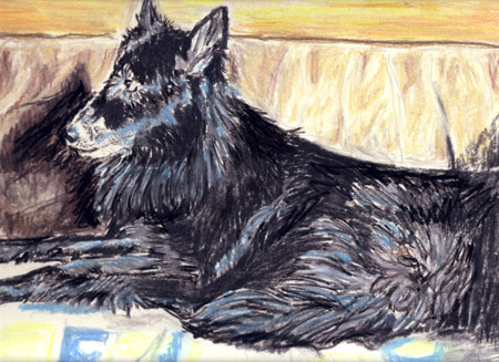
After you've worked on the dog's fur, add more details, by giving the fur more texture with dark and lighter parts, and do the same for the couch, the blanket and - if necessary - the painting and wood (as in: other parts). You're almost done.
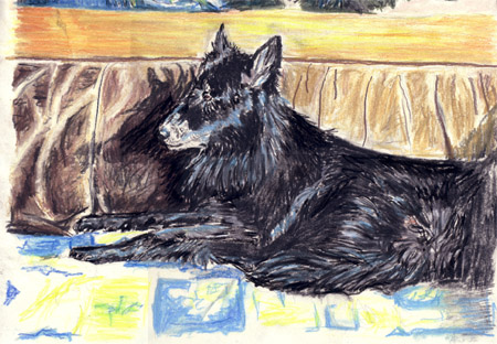
Gently blend with your tortillon and apply small shadows with residue from the dog's fur to achieve depth and folds onto the blanket. If in the end, some mistakes continue to bother you, such as dark places that need not be dark, highlight them with a little bit of waterpaint - or acrylic - but only if you can no longer fix these mistakes; as a last resort, if you will.
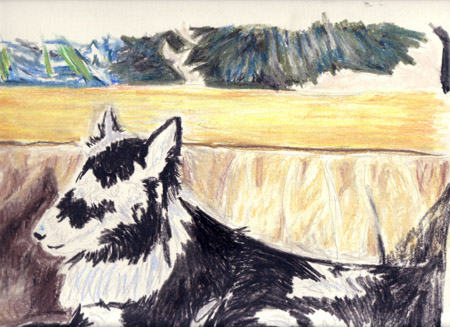
Your drawing is now almost done. Leave it as it is for a little while, then look at it again and decide whether it's really done or not and tweak it a little. There's no shame in ruining a drawing. I've done it countless times, big deal. Good luck!
Behold my result after two hours of painting. Though it's not one of my best pictures, looks a little rough even in my book, it still is a nice picture altogether. The colour scheme is slightly different, though on purpose. Photorealism was never my goal, as you likely know by now. Again, good luck and enjoy.

Also, if you want to point out something about my tutorials or if you have questions, feel free to email me about it at josav@josav.com
Back to Tutorials
Back to Sundry
Back to Main